Hudson & Hudson Antiques
A logo takes time to create. You need to find direction and inspiration from the company or organization you are creating an identity for. This is why I understood the importance of incorporating some fine details of antiques into my logo.
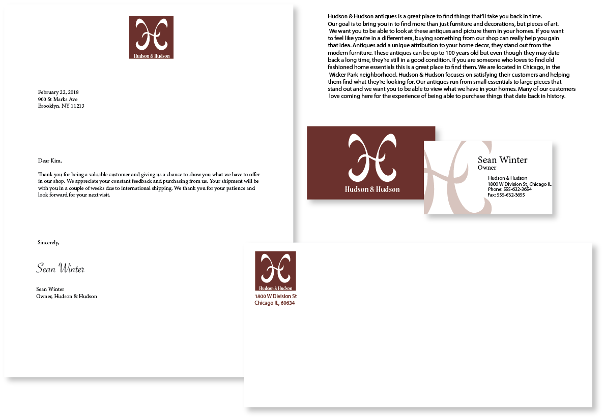
Many antique tables and chairs have a swoop-like curve to their design. The color in the logo represents the dark tones many antiques have in their appearance. The logo offers it’s audience a theme of elegance and sophistication. The watermark in the background gives a small detail to the business card and continues the theme of elegance and refinement.
Makeup Brand
This is an exploration of creating my own makeup brand. I chose to name it Dirty by Diana but for short, just Dirty. I used the font Astina by Rochart Studio in the brand name. The reason for the name is based on the 80's pop-culture look. I wanted something different and explorative.
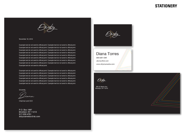
I used my knowledge of logo making and type setting to understand how I wanted to present my work. Typography is very important when it comes to legibility and selling your overall design.
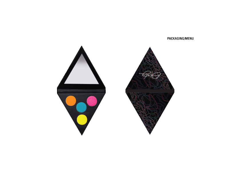
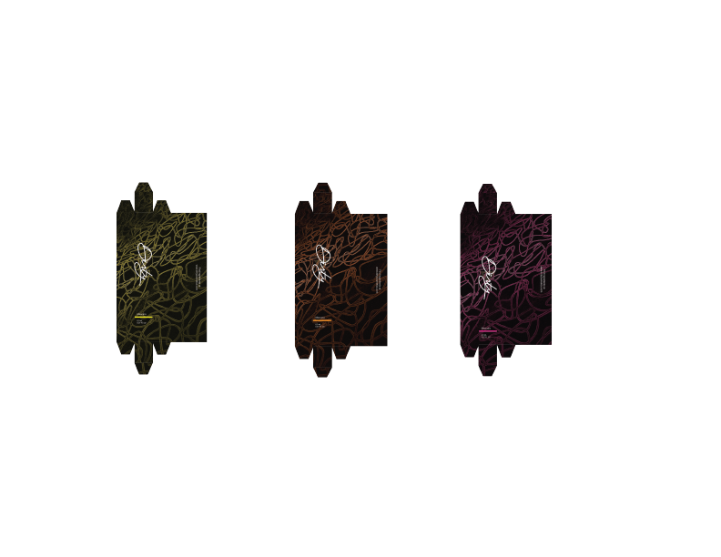
Here are some examples of products. I used the idea of creating my own color palette throughout my process. I wanted the colors to pop and stand out, which is why there are neon color choices. The colors are in relation to the 80's look, I wanted the packaging to look unique. It consists of a swirl-like design and is assigned a specific color based on the color palette.