
Recipe Book
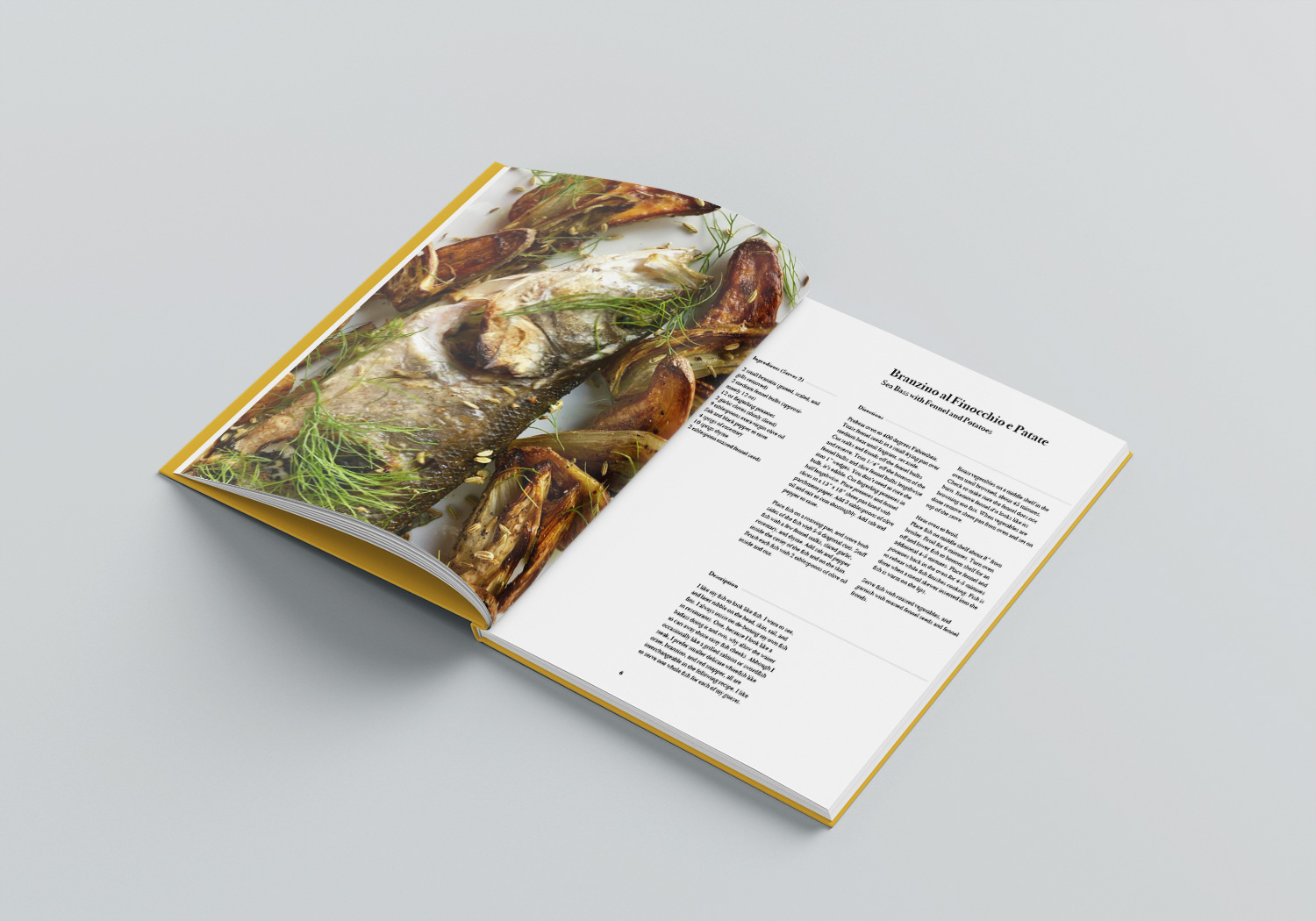
For this project, the task was to create a recipe book. I focused on the aesthetic and what the client wanted their audience to see. I wanted a clean eye appealing look. I also used an image covering a full page in order to draw one's attention and entice them to try the recipe.
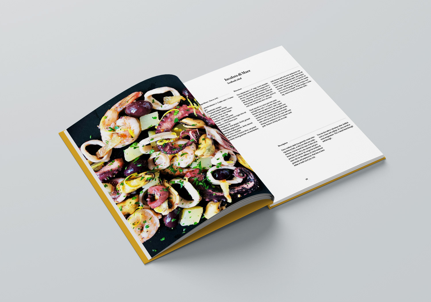
In terms of organization, I wanted the reader to be able to locate each section easily. I used ragging and set certain rules for the spacing of the text layout. The sections start with the ingredients in the left side column. The reader then transitions to directions in the right hand column. Finally the bottom column offers a description of the author’s experience enjoying the meal.
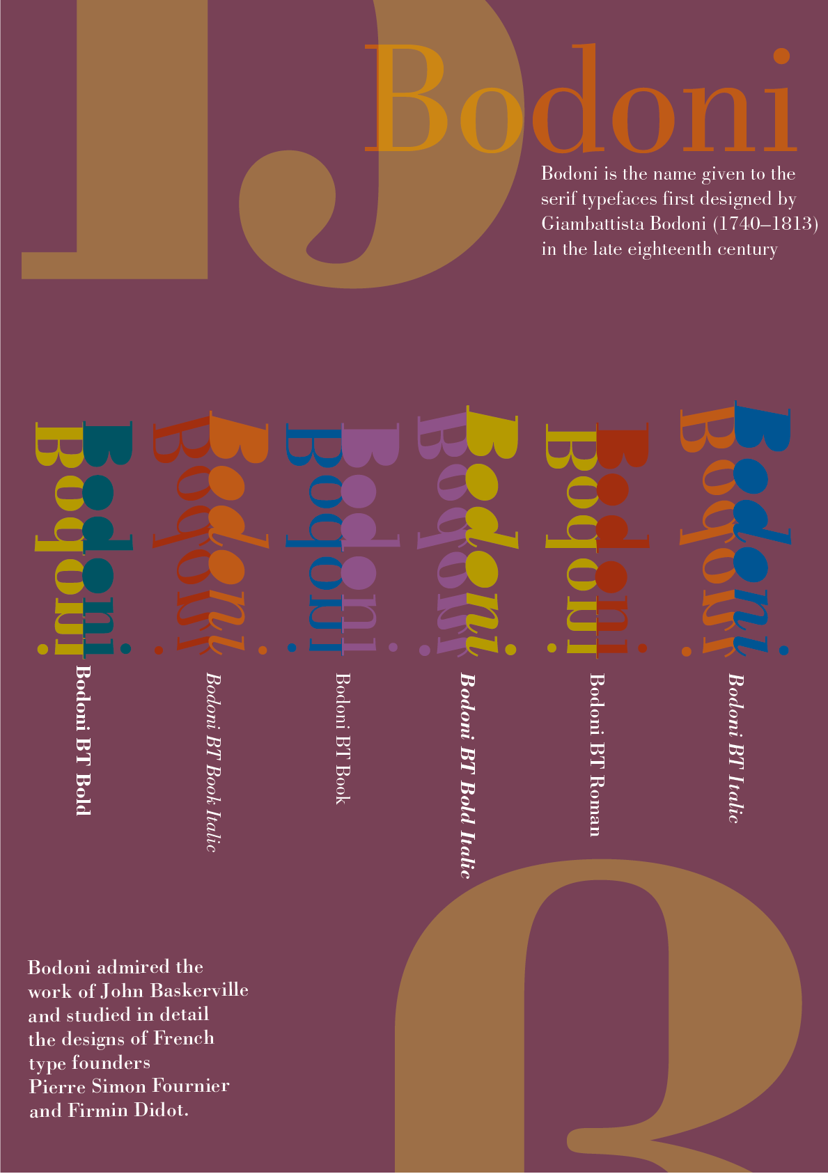
BODONI FONT BOOK
The objective was to create a book based on a specific typeface. My typeface was the family of Bodoni, a serif typeface.
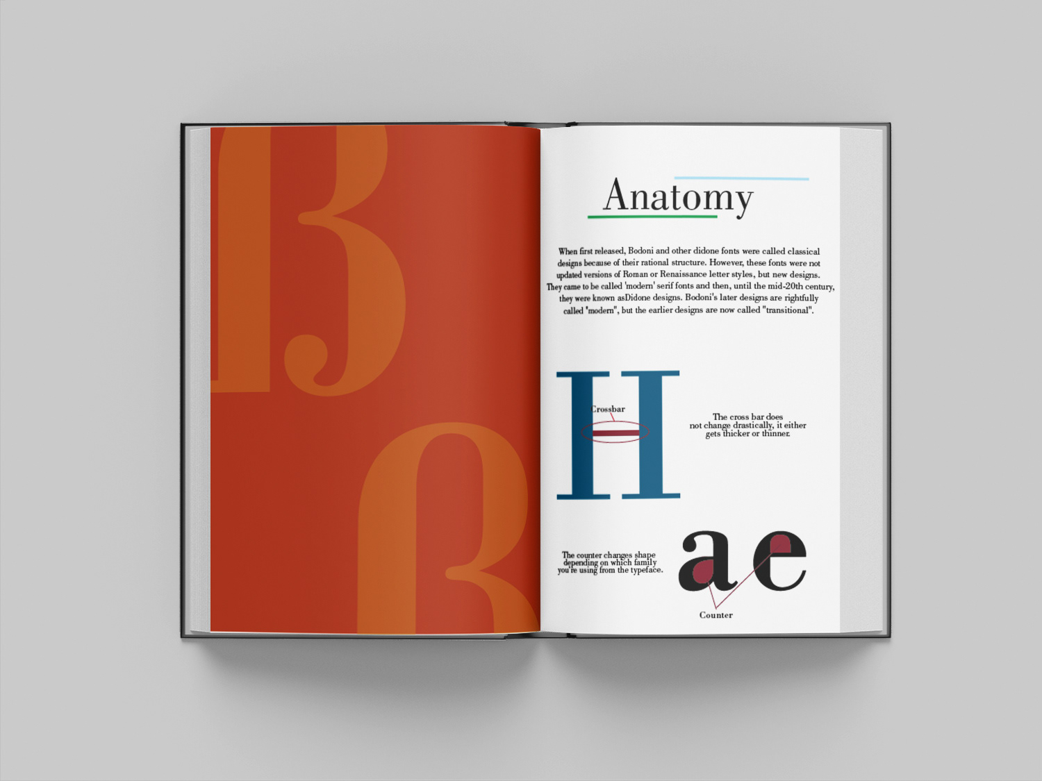
Throughout the book I created a consistent color palette. I incorporated it’s characteristics, anatomy, history and where it has been used. I kept a consistent layout so it would be easy to follow and read.
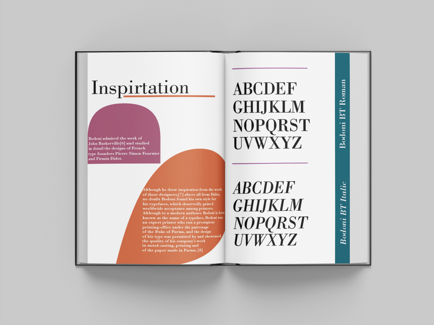
The poster was inspired by my color palette and emphasized the different types of font styles and weights the Bodoni family consists of. I added small paragraphs containing information about the font onto the poster as well.
Word Exploration Project
This involved discovering creative ways to express a word and it’s meaning using type.
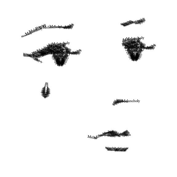
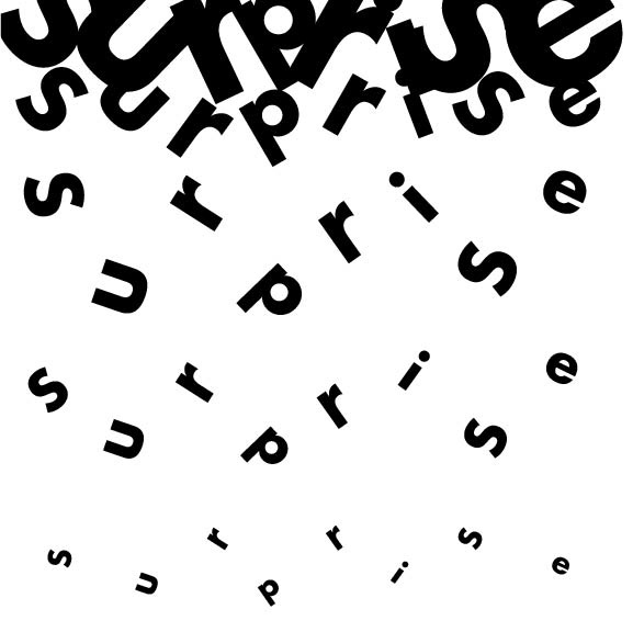
For the word "melancholy" I chose to create a visual of a woman crying by using the repetition of the word to create the image. I chose to use a confetti visual using type for the word “surprise” because of its association with celebration. I wanted to explore sizing of the letters to put emphasis on the confetti falling.